


What kind of a logo is that?

What's the goal of a logo?
I've always admired logos that said something. Some logos just look cool, but for me the ones that endure have some storytelling in them.
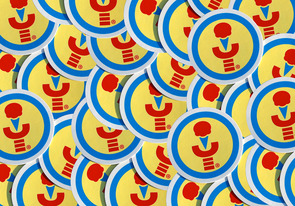
As Billy Wilder once said, "Make the subtleties obvious." So I kept it obvious - A robot arm, holding an ice cream cone, inside of a circle, which alludes to the Moon—where the story of Robots and Ice Cream takes place.
The other criteria (in my opinion) for a strong logo is that it should work in black and white. I think gradients are very limiting, so I'm a full-opacity kind of guy. My aim for the logo was for a bold, sturdy, graphic design.
So there you have it: Robots, ice cream, and the Moon, all in a quick-reading, bold, graphic logo. I sure enjoy it, and I hope you do too. Let me know what you think of it!
Comments